For Benjamin Roberts’ Capstone, he formed a trio of software developers to engineer an app called Shuffle Trip. His team struggled to fix complex logic code and simplify unintuitive UI, and there was a larger mess when those two things collided! However, through long 4AM grinds and longer grinds of morning coffee, the team was victorious. Through the ups and downs of software development, they released a “dirty demo” on deadline.
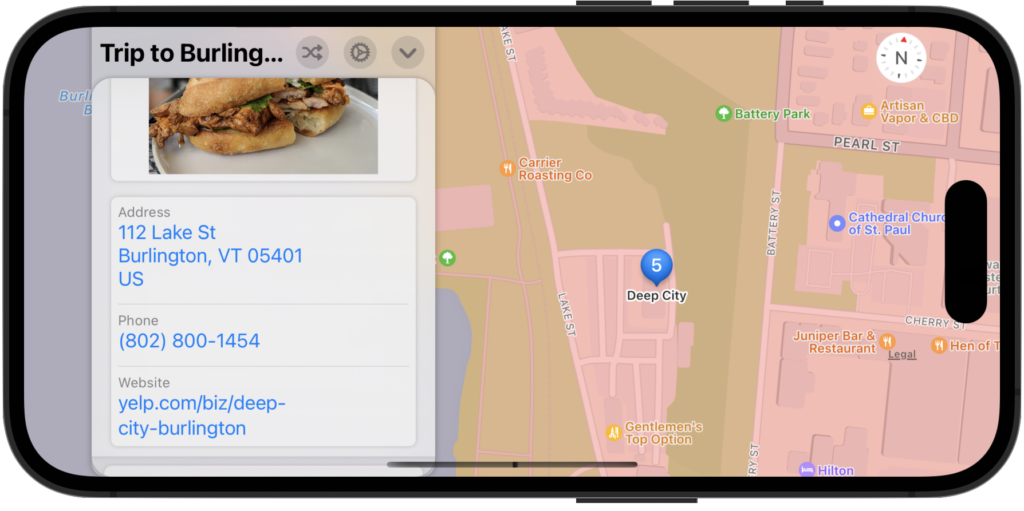
Shuffle Trip is exactly what it sounds like. If you want to take a trip to rainy Seattle, scorching Arizona, or unstable Yellowstone, boot up the app. You can add crucial activities to your trip, which may include hotel-ing, feeding yourself, and/or splurging in the Best Buy tech section. You can even add friends to the trip, or copy the trip and make it manually on Apple Maps. If you don’t like the to-do provided on your randomized trip, just shuffle it.
Roberts commented: ”That’s kind of the idea, being able to rapidly create new trips over and over again until you find something you like.”
Human-chosen activities…
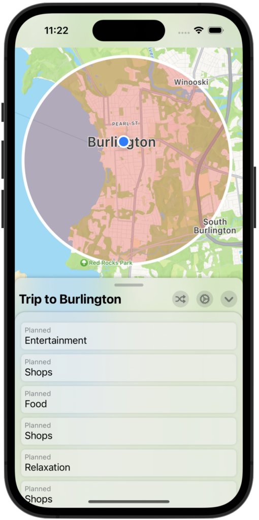
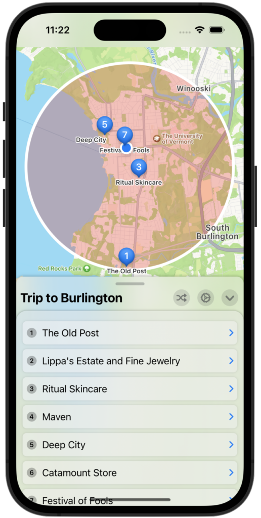
…computer-chosen trip.
For the user, shuffling is as simple as pulling up the menu from the bottom of the screen (AKA the bottom drawer), entering in tags, and hitting the Shuffle button. But for front-end developers like Roberts, the bottom drawer alone takes writing over a hundred lines of code.
Their Back-End Software Development (Or Everything Users Don’t See)
So let’s (tentatively) dive into the code.
Joe Marchensini (the lead API developer) and Drew Marcotte (the lead database developer) were responsible for the back-end. Roberts, on the front-end, didn’t have as much to say about the other side. Core themes of my talk with Roberts were the importance of separating logic code and UI code, and how key it was to organize code into blocks.
When he showed me the code, he praised the Leahy Center for what he learned. His leadership role in the IoT Extraction team taught him how to make code concise. He also improved at recognizing when bugs will occur, which has saved him literal hours of testing time. But Roberts especially took away the importance of inline documentation, which he mastered in Capstone. He documented nearly every line in the Shuffle Trip code, getting the understanding out of his head and making coding easier for his teammates.
Clicking on a line of code pulls up a window showing its functions and variables. That makes it much easier to grasp what said line is doing. In the last two weeks of the project, Marchesini had to make a switch over to the front-end. He had never worked front-end before. It must have been brutal with the documentation. Without inline documentation, adjusting in time would’ve approached impossible.
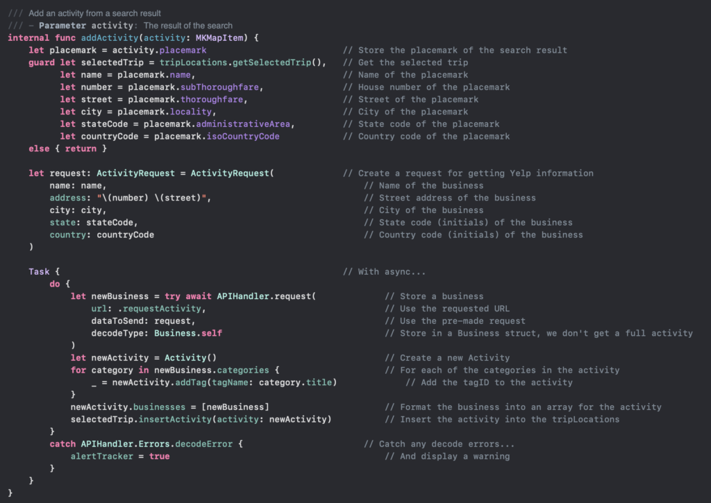
Code that adds an activity to a trip from a search result.
Roberts also learned that setting up the tech stack is the first thing you do—and you only change it mid-project as a last resort. A tech stack is the stack of technology developers choose to be the foundation of their software. In Shuffle Trip’s case, their stack consisted of Apple’s tech and Scala’s programming language.
He’s gotten flak for choosing Apple’s tech exclusively, as it restricted the app to Apple devices. However, he had his reasons. Shuffle Trip’s development had an unignorable cost factor. To get functionality out of Google Maps, Roberts would’ve had to cough up two grand a month—more than the average US rent. Apple Maps only cost a hundred dollars a year for equal functionality. Obvious winner there.
Exclusively designing for Apple also reduced the workload. Android and iOS both use different design languages—Android uses Java and Apple uses Swift. Swift takes less coding work and is simpler to use, which was a relief for the team.
“For example,” Robert explained, “the Spotify and YouTube apps. How do those look [or] function at all similarly? They don’t. By sticking with Apple’s platform, we [had a clear] design target to hit.”
The IoT Extraction team was responsible for extracting data from Android devices. That responsibility may have informed his decision further.
At the beginning, they chose to work in Python, but then they moved to Scala—a Java-like language. With this move, he realized changing the tech stack mid-development is like pulling out the bottom planks in Jenga. Like a fallen tower, the change in programming language caused pieces of code to tumble and have to be rebuilt from the ground up.
Roberts learned these lessons the hard way. Without his and his team’s growth mindset and vicious determination, this project would have certainly failed.
“I’m a big believer in ‘failing fast,’ “ Roberts said. “So like, build something, see it sucks, scrap it, build something else.”
Their Front-End Software Development (Or Everything Users DO See)
They sorted their code into folders to make navigation easier. Two of the folders in Roberts’ code are Bottom Drawer V and Bottom Drawer VM. Bottom Drawer V stands for Bottom Drawer View. Bottom Drawer VM stands for Bottom Drawer View Model.
The team uses the design pattern MVVM, or Model View Viewmodel. This separates UI controls (or how the user interacts with the screen) from the logic (how the program runs in the back). Roberts stressed that they had trouble when they combined UI and logic code. A pattern that separates them was a great choice.
The Model View Viewmodel pattern is divided into a model, a view, and a view model. When using an app, the view is what you see and interact with. The view model is responsible for how you control the view, and acts as a middle man between the view and model. The model is the logic of the program; it uses information to make the app run for you.
For example, the bottom drawer itself is the view, but the view model determines how you interact with it. The view model controls how the drawer snaps to certain points on the screen.
Speaking of the drawer…
Much of my interview with Roberts was about Shuffle Trip’s bottom drawer. Considering he dedicated two folders to it, it’s safe to assume developing the drawer was not easy.
“The bottom drawer really is kind of like my child,” said Roberts.
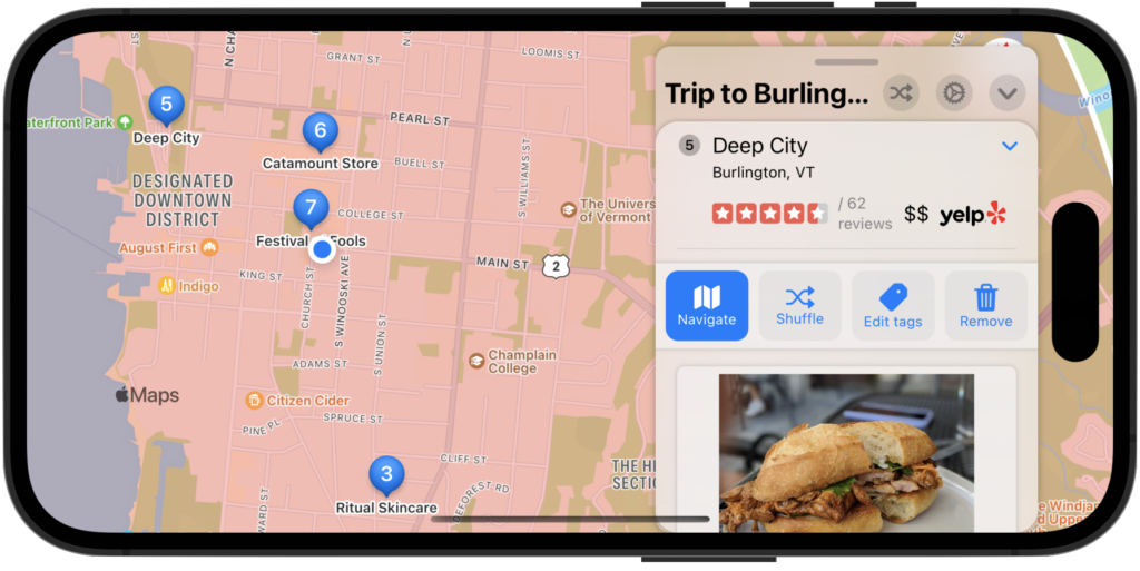
Bottom drawer on the right side.
Bottom drawer dragged to the left side.
In the beginning, Roberts made a sketch of what he wanted the app to look like. In the end, the app was wildly different from what he planned.
He wanted the UI to look good no matter how you turn the phone, so Shuffle Trip’s bottom drawer works differently in landscape. In portrait, the drawer covers the bottom half of the screen. In landscape, that same design would look like a freakish UI hamburger fold. Instead, Shuffle Trip’s landscape view makes the bottom drawer go to the top, while only taking up about a third of the screen.
“[The View Model] is saying, ‘Hey, view… I’ve noticed that we are no longer vertical or we have a lot of extra space horizontally. [Make the bottom drawer smaller.]’ “
You can also drag the drawer from left to right, and it will snap at convenient points. Roberts did all this and more, so now the dragging feels natural. Ironically, I promise you that that is NOT a natural thing to do with code.
The bottom drawer is something that has to feel intuitive UI-wise while being convoluted logic and back-end wise. Considering that, I’d say he went above and beyond with landscape mode.
“It’s just a lot of ‘test, nuke it all, try it again, that didn’t work, jump into Desmos, follow the line.’ It’s a labor of love.”
UI design is sort of like programming. The little improvements add up and collaborate to form a functional whole. Roberts added many features to the bottom drawer. When you pull the drawer back down, the content fades out so you don’t see the tops of letters. The bottom drawer is also transparent, so it takes on the colors of the map. If you’re out in the green woods, the drawer will take on the green colors of the Apple Maps background. Shuffle Trip also uses an anti-dark pattern, saving users from mindlessly reshuffling a trip.
Many sites use morally questionable tactics called dark patterns when asking you to accept cookies. The colorful accept button will pop out, and the manage button (the word decline is too likely to engage users, after all) will be camouflaged. This scheme takes advantage of your subconscious to rob you of a choice.
Shuffle Trip flips this idea on its head and makes the Don’t Shuffle button pop out. If you space and hit the most enticing button, your trip doesn’t get atomized.
Roberts mentioned that the map is the primary content. It was the first thing he added, after all. This project taught him that UI has to be built upwards. When you paint a tree, you start with the trunk, then move to the large branches, then the stems branching off of the larger branches. Similarly, Roberts built the map, then the drawer above the map, then the drawer content, then the content that content makes, then the content that content makes, and so on.
Finishing Development (So They Can Release The App!)
The team is wrapping up loose ends so they can launch to the App Store. The main issue Roberts cited was that their back-end can’t handle many users right now. There’s also a UI problem: shuffling a specific activity doesn’t spawn a loading icon. The page sits there and randomly updates when it finishes, which isn’t intuitive.
The team has been taking steps since Capstone to move Shuffle Trip from “dirty demo” to downloadable data. They’re working on making the back-end more scalable to a large audience, and adding extra cybersecurity precautions. The UI bug should be an easier fix.
“My big rule of thumb is: ‘Do I enjoy using this? No? It needs work!’ ”
Roberts, newly holding a Bachelor’s in Computer Science and Innovation, now joins the job hunt. He’s soon set to launch his first app, securing a place in software engineering. He’s learned plenty of mobile development skills to carve out a place in his field.
Sources:
https://www.mooc.org/blog/ios-vs.-android-app-development#:~:text=For%20both%20new%20and%20experienced,use%20Java%20and%2For%20Kotlin
https://www.techtarget.com/whatis/definition/Model-View-ViewModel
https://www.deceptive.design/
Stay up to date with Twitter, Instagram, Facebook, and LinkedIn so you always know what we’re up to!

By Briar Gagne ’26, Professional Writing
Briar Gagne specializes in technical writing and copywriting, with a strong focus in cybersecurity topics.